Finance, Audit, Accounting and Tax.
FAKT - Accounting, New brand identity
FAKT Consulting was founded in 2012 in Prishtina, at the Kosovo Business Registration Agency (KBRA) in the Republic of Kosovo.
Has continuously expanded its services with local clients (associates), also in the regional market (Albania and Macedonia) and in the international market, providing services and consulting in various economic fields,and applying best accounting systems, with the digitalization of businesses, recommending and applying appropriate digital platforms.
In addition to the services mentioned above, “FAKT Consulting” also provides other services, for more information visit FAKT.
FAKT contacted us for asked to rethink the visual identity and communication materials.


Concept
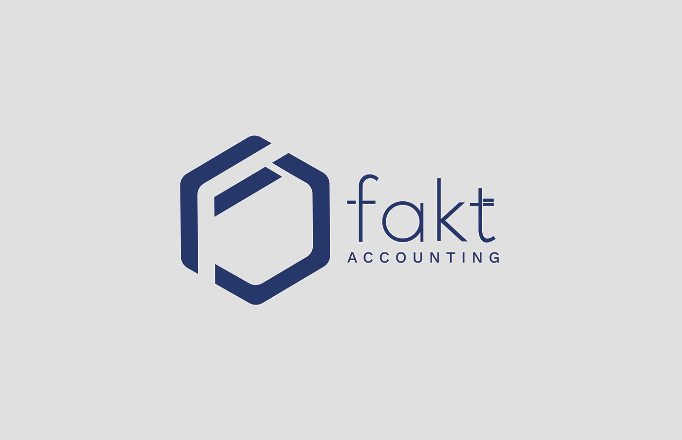
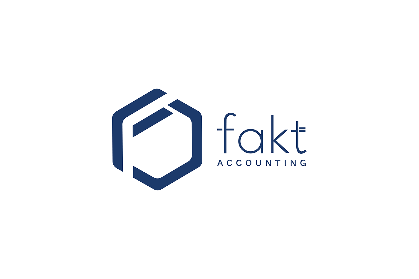
For the rebranding of the "Fakt Consulting" logo, we have used the elements of the letters "F" and "C" combined with the shape of a cube. These elements have been chosen to symbolically represent the identity and values of the company.
The letter "F" represents a range of terms such as "focus," "power," "flexibility," and "functionality," as well as the company name. By symbolizing these qualities, it conveys stability and influence in the consulting industry. On the other hand, the letter "C" embodies meanings such as "consulting" and "competence," representing aspects related to problem-solving and providing specialized advice to clients.
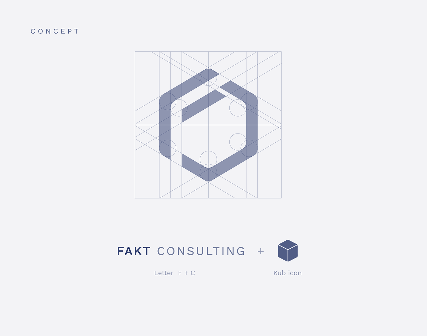
The shape of a cube in the logo brings forth concepts such as "stability," "structure," "integrity," and "synergy." A cube is a three-dimensional figure with clear and regular edges and faces. The use of a cube shape in the logo suggests stability, organization, and the ability to offer sustainable and structured solutions to clients.
Through the combination of the letters "F" and "C" and the shape of a cube in the "Fakt Consulting" logo, the company conveys an image of strength, power, influence, problem-solving, and professionalism in the fields of consulting, finance, auditing, accounting, and taxation.
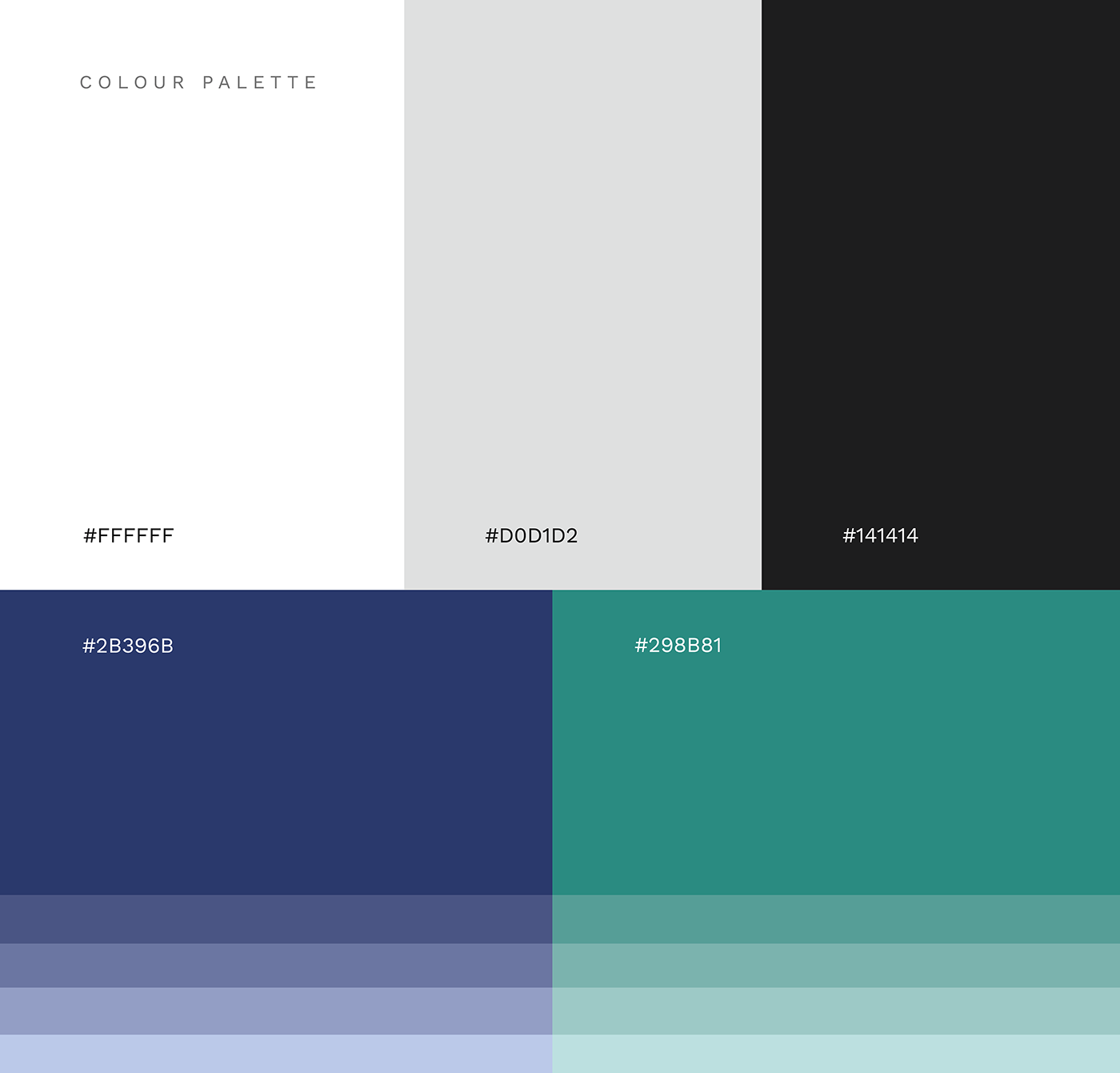
Color Palette
The color palette used in the rebranding of "Fakt Consulting" includes the primary colors of white and black, as well as the secondary colors of blue, green, and gray.
The combination of these colors in the "Fakt Consulting" logo creates a sophisticated, professional, and trustworthy image for the company, symbolically representing its values and field of expertise.

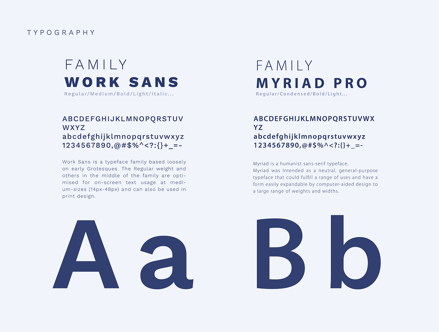
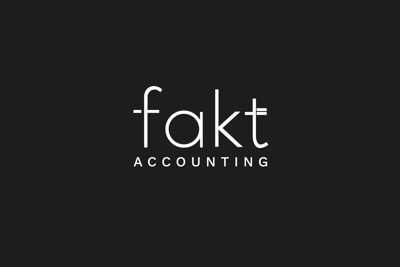
Typography
The combination of the Work Sans and Myriad Pro fonts for the typography of the "Fakt Consulting" logo is a good and thoughtful choice.
In summary, the combination of the Work Sans and Myriad Pro fonts in the "Fakt Consulting" logo creates a modern, minimal, and professional presentation.
This typographic choice aligns with the sophisticated and trustworthy image that the company aims to represent.